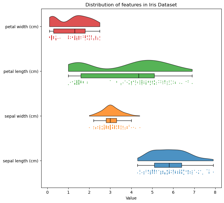
Displaying distributions with raincloud plots
I’ve tried to visualise and compare distributions using violin plots for reports and presentations in the past, and the feedback I’ve got was generally… not great. When searching for better methods I came across this excellent blog post by Alex Belengeanu on raincloud plots and I’m now a big fan.
Plotting complex distributions
There’s lots of methods for visualising distributions to compare different populations, and each has its own pros and cons. Histograms (often with a kernel density estimation) are good method for showing complex distributions, but it’s not possible to easily compare statistics such as the mean or quantiles from the raw graph, and there’s also some loss of information from binning or smoothing, which could misrepresent the data, such as making discrete values appear continuous. Box and whisker plots are great for being able to compare statistics such as means and quartiles, but they don’t represent complex distributions such as bimodal data well. A jitter plot is good for showing the structure of the underlying data, but difficult to compare statistics or absolute densities of points.
A violin plot with box plot combines the strengths of the two methods to visualise complex distributions with easy to read off statistics. The main downside is they’re ugly (IMO). Every time I’ve used them in a report or presentation the discussion has veered off to whether they look more like sea creatures or medieval weapons than violins, with very little discussion of the actual data!
Whilst searching for better methods I came across this blog post by Alex Belengeanu on raincloud plots, which seem to be the best alternative.
Raincloud plots
Raincloud plots are pretty simple, they’re just a combination of half a violin plot (sometimes called a ridgeline plot), a box plot, and a jitter plot. They’re intuitive to read and show distributions clearly, as well as being much more aesthetically pleasing than many alternatives. I’ve customised Alex Belengeanu’s code to suit my needs, and it’s all in a function in this GitHub repo.
